The strategy was to encapsulate their two distinct identities, shared love for olive oil, and innovative approach to production. The aim was to weave their stories together to create a brand that was both rooted in the historical and vernacular aspects of Sicily and reflected their contemporary perspective.
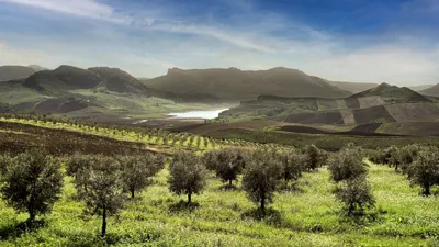
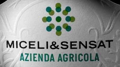
The brand’s symbol was created using two squares made of dots in different shades of green. When overlapped, these squares formed a new green, symbolizing the combination of the two partners’ complementary characteristics to create something unique. These squares also formed a perfect sun-like shape, hinting at the sun-soaked olive groves of Sicily.
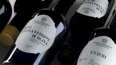
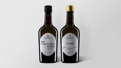
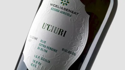
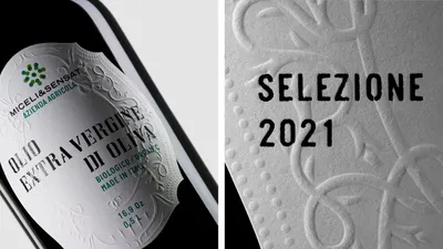
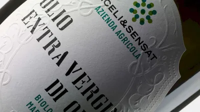
In terms of the label design, traditional elements were used in a contemporary composition, like musical layers overprinting on each other to create a new arrangement. The main headline font was custom-made, inspired by the stencil used for street names and numbers in some Sicilian villages. The secondary font, Italian Plate N1 by PlayType, was based on car plates from the ‘60s. This design strategy resulted in a label that combined diverse influences to produce a unique personality, reflecting Sicily’s rich cultural history while showcasing a modern, fresh approach to olive oil making.