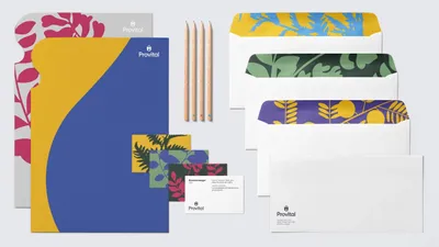
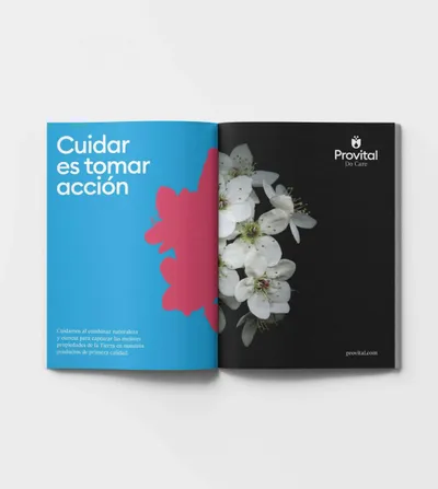
Logo Logo
  • Work
  • Strategy
  • Sharing
  • About
  • Shop
  • Contact
  • Work
  • Strategy
  • Sharing
  • About
  • Shop
  • Contact

Provital

A B2B brand that redefines what 'taking care' means

Industry

  • Beauty & Self-Care
  • BioTech
  • Healthcare

Services

  • Brand Identity
  • Digital
  • Editorial
  • Motion
  • Strategy

Strategic approach

This is the story of a B2B company in the process of transformation. It is also the story of a brand finding a purpose that transcends its industry and that proposes a new look towards personal care.

Ingredients for the transformation of a brand

Provital is a company that provides solutions to the cosmetic industry through the development, production and sale of active ingredients and extracts of natural origin for skin and hair care. With 40 years of development and presence in 5 countries, this company operates in a very complex environment.

It is a highly atomized market, where the leaders alone take a quarter of the market share against a multitude of competitors, and with the Chinese market on the rise, even more competitive products are being offered.

This environment is one of low differentiation, where brands are defined by a functional, technical and corporate positioning. A sector dominated by constant renewal, it requires increasingly innovative and multifunctional, as well as natural and locally sourced, products.

The change

In this context, Provital identified a great challenge: to reach the big players in the cosmetic industry and expand to new regions.

How was it done?

Through a global brand, strong and consolidated, with clear and differential positioning, capable of growing with the company, expressing its essence and promoting it even further…

At Mucho, we collaborated with Provital in this rebranding process, working jointly with them to redefine the brand’s strategy.

The emotional side of chemistry

The first decision was a very simple, but exalting change: Provital dropped the second word from its former name, Provital Group. A versatile name, appropriate for its international presence (current and future), and that evokes a powerful meaning (“for life”).

The brand needed to communicate a value to not only its customers, but to everyone who comes into contact with its products. We discovered that behind the science and technology, there was a value as sensitive as it was relevant: caring. The act of caring.

Provital believes that care means taking action. And so the company does, through its strong commitment to ethical and sustainable development: caring for communities, the planet and all people, from its internal teams to the final consumer.

It was time to highlight and communicate this powerful purpose.

A commitment to care that turns into action

The combination of science and technology, the collaborative spirit, the agile and effective work dynamics, the eagerness to offer inspiration and create emotions, and their belief in the diversity of beauty… These elements are all part of the essence of the company and give life to the new narrative of the brand. They are key in defining the tone of voice and personality of the brand. These elements were translated into a purposeful and engaging tagline: Do Care.

A clear, firm and concise statement that reinforces Provital’s conviction.

A vibrant and dynamic identity like nature

To design the new visual identity of the brand, we relied on the flowers and plants that are used in Provital products. We styled them as lively, energetic and colourful, reminiscent of the compositions of the ‘70s, the era in which the company was born.

Provital extracts are the essentials of nature, and because of this, it was decided to draw nature in its most essential feature: silhouettes. In addition, the wide range of colours show the beauty of diversity, and work to invoke emotion and inspire customers.

One of the main characteristics of the brand identity that complimented this style of imagery, but had a more ornamental character, is a modular pattern, built from the two main elements of the logo: the flower and the drop.

A global brand is a unique brand

The new brand identity was supported by a redefinition of its architecture. Provital has a complex product structure that was in need of simple and clear organization. 

In the B2B cosmetic industry sector, where new product launches and innovations happen everyday, communication plays a leading role; campaigns, catalogs, presence in specialised magazines, events and conferences. This is an environment in which it is necessary to stand out as much as a B2C brand.

First of all, with a unique brand. Provital would be the same brand at a corporate and commercial level. A monolithic architecture that promotes the solidity and consistency of the brand.

And later, with a flexible and dynamic structure, where the portfolio is organised by categories, applications and campaigns, allowing products to be classified in multiple ways.

Related projects

149

Skinlove Natural joy

160

ThyHalo The Optimised Self

167

Paradigm Better Outcomes for All

177

Antheia Nurturing Nature to Create Better Medicines

We look forward to hearing from you. For new business, please contact the closest office directly. For general enquiries, please email us: info@wearemucho.com
San Francisco

+1 415 546 1399
sanfrancisco@wearemucho.com

466 Geary Street, Suite 500
San Francisco, CA 94102

Melbourne

+61 414 867 860
melbourne@wearemucho.com

Office 3, Level 2
358 Lonsdale Street
Melbourne VIC 3000

Barcelona

+34 93 481 40 89
barcelona@wearemucho.com

Morales, 27K
08029 Barcelona

Paris

+33 (0)1 73 71 58 20
paris@wearemucho.com

80 rue Taitbout
Square d’Orléans
75009 Paris

Copyright © 2023
  • Terms
Subscribe
Logo