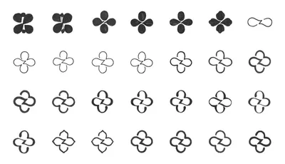
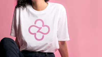
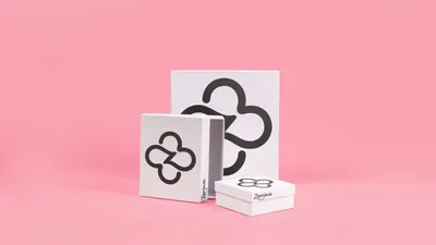
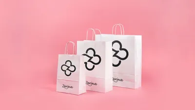
Our co-creation process entailed numerous workshops and collaborative meetings that helped us grasp Zarina’s vision and establish a robust value structure. Sketching sessions led us towards a design that symbolizes a woman shaped by diverse experiences yet preserving her youthful, fun nature. The decision to use a flower as Zarina’s symbol resonated with this design concept; like the first herald of spring blooming amidst snow, it symbolizes femininity, romance, beauty, and care.
Zarina
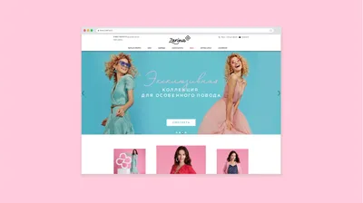
Zarina, a major female apparel retailer based in Russia since 1993, decided to evolve its brand after 25 years. Recognized for its traditional designs, Zarina sought to position itself as a purveyor of modern feminine classics.
Our rebranding collaboration involved developing a new logo that encapsulates Zarina’s essence and communicates its message to a broad audience.
The renewed brand spirit, which centers around fulfillment and womanhood, was to embody Zarina’s identity.
Services
Brand Identity
Industry
Fashion & Luxury
The monostroke calligraphy of the logo suggests an open and easy-going approach, with the elegantly designed “Z” rising above the cap height of the other letters, lending a balanced feeling to the logo. Furthermore, we devised a flexible brand system permitting the logo and the symbol to coexist or stand separately, emphasizing the brand’s adaptability.