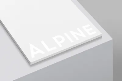
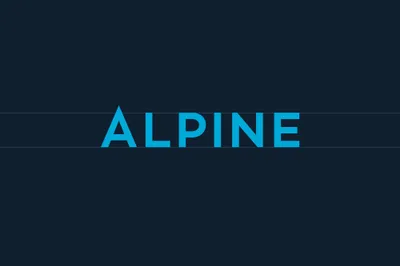
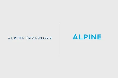
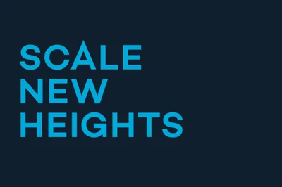
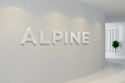
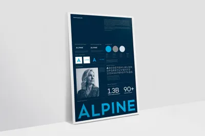
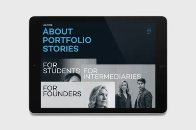
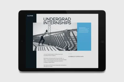
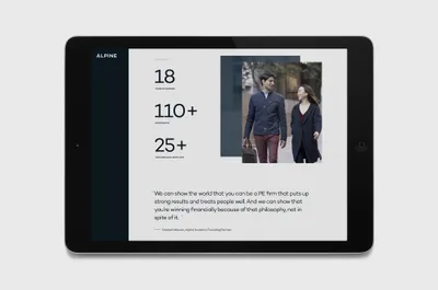
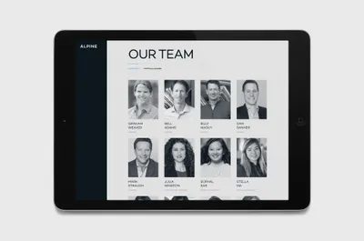
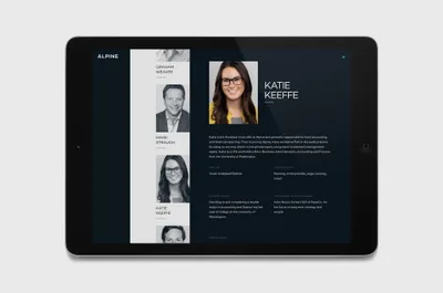
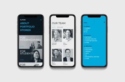
With this philosophy in mind and after several discovery and strategy workshops we created a new brand identity and website. Their existing identity suggests the idea of mountains and climbing higher in a crude illustrative way. We simply brought these two ideas together in an elegant word mark. We then saw the opportunity to take an all caps typeface and extend the height of the ‘A’ above the cap height of the other letters. This subtle but cleverly crafted word mark references the meaning of the word ‘Alpine’ but more importantly recognizes their ultimate goal to help their portfolio clients and employees climb higher, faster and reach their peak potential.
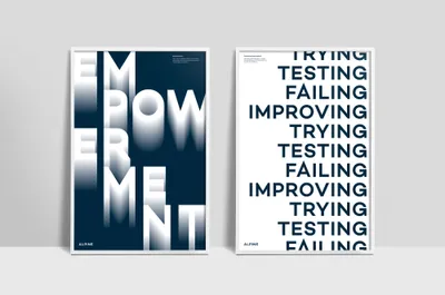
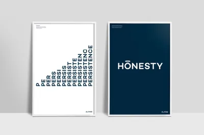
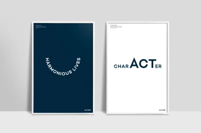
The real differentiating factor of Alpine is their “People Driven” approach to Private Equity. To demonstrate this throughout the brand we used a simple copy vernacular, created alluring people focussed photography and developed a set of ‘Value’ posters for their office, playing with typography in a witty, approachable way.
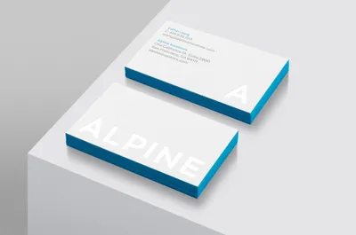
Color palettes of white on white, deep rich blues and turquoise were derived from snow-capped mountains and Alpine lakes. These all helped to create an elevated, sophisticated and modern look and feel while remaining extremely honest and trustworthy.
Website design and development: Anton & Irene
