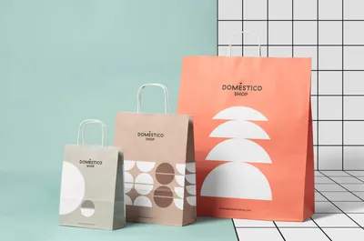
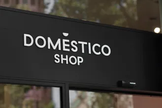
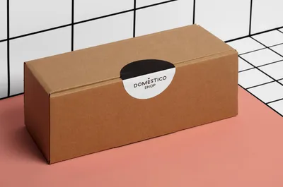
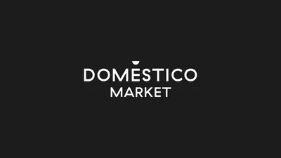
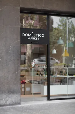
The strategy involved transforming a potential drawback - the accent in “Doméstico” that was problematic in online settings - into a distinguishing characteristic. This was achieved by substituting the accent with a semicircle, thereby enriching the brand’s personality and ensuring its compatibility with digital platforms. The semicircle served a dual purpose, functioning as an integral part of the logo and also as a stand-alone element that could be used to develop various visual representations.
Doméstico Shop and Doméstico Market, while sharing the same codes, implemented them differently. The former focused on minimalist compositions with a single semicircle size and an expanded color palette.
This approach allowed for rhythmic arrangements of semicircles transitioning through a spectrum of colors.
The latter retained an abstract style, with horizontally aligned semicircles resembling small objects and a characteristic finish of brown kraft paper printed in white. The figurative character and finish differentiated Doméstico Market from Doméstico Shop, reinforcing their distinct identities within the overarching brand.

