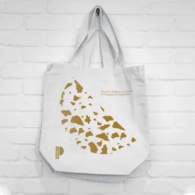
The strategic approach revolved around the geometric representation of these delicious takeaway meals. It aimed at capturing the playful essence of the brand while maintaining a premium look and feel. A crucial part of the strategy was to design a brand language that would allow for varied patterns and compositions across different applications.
La porteña
La Porteña is an Argentinian empanada bakery located in Brussels, crafting high-quality empanadas using traditional recipes. The aim is to recreate the authentic Buenos Aires culinary experience, a sentiment captured in the brand motto, “Flavors from elsewhere in the heart of the Argentinian empanada”. The project entailed creating a visual identity for La Porteña that encapsulated this unique blend of tradition and quality.
Industry
Food & Beverage
The design solution was to create a logo that combined basic shapes with textures and “crumbs” for a joyful yet sophisticated effect. This logo, combined with the playful brand language, not only captures the geometric shape of the empanadas but also conveys the fun and excitement associated with enjoying them. This distinctive branding helps La Porteña stand out, enhancing its premium image while staying true to its Argentinian roots.