Value
Meaning
Future
Designed
Work Hospitality

Pacha Group

A legendary story of nightly leisure has established Pacha as an iconic nightclub brand. But when the company extended its efforts to consolidate hospitality and international presence, the brand wasn’t ready. The cherries icon is arguably the second most well-known fruit logo after a certain apple, but the brand architecture wasn’t there. Here is how we designed the ecosystem, with some cherries on top.

Industry
Hospitality

The Challenge

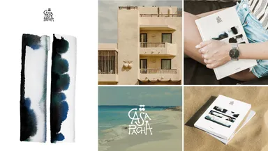
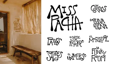
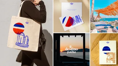
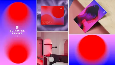
Pacha, a dynamic company with a diverse brand portfolio, spanning nightclubs to hotels and beachclubs, faced a significant challenge. Mucho was tasked with enhancing its appeal to younger audiences while also facilitating broader brand expansion. This effort was further complicated by the complex structure of Pacha’s ecosystem. 

Each outlet within the brand had its distinct character that needed to be preserved. The challenge lay in crafting a narrative that could resonate with a younger demographic, support growth aspirations, and maintain a cohesive brand identity across a diverse range of outlets.

The Strategy

Our strategy for Pacha hinged on two critical facets. Firstly, the need to go beyond the conventional concept of fun, linking Pacha to the essential value of curated celebration. This vision drew from pillars like emotional connection, Mediterranean heritage, a soundtrack for life, and the magic of creativity. Secondly, we strategized to weave this master narrative throughout all of Pacha’s diverse outlets, by nuancing it with specific sub-narratives. We ensured each entity’s identity was both unique yet intrinsically linked to the overarching brand narrative, thereby creating a cohesive yet diverse brand ecosystem.

The Solution

Following a comprehensive analysis, we redesigned Pacha’s iconic cherries logo for digital versatility while ensuring brand coherence across diverse outlets. Each outlet then received a custom, imaginative identity, reflective of Pacha’s core values and unique to each setting. Casa Pacha, our boutique hotel brand, received a playful, Dali-inspired logo and a serene watercolor-based graphic language. Lío, the must-visit cabaret restaurant, received an upscale typographic upgrade encapsulating its wonder and playful sexiness.

Destino Pacha, the luxury beach hotel, got a logo reflecting its sun-bathing promise, paired with a deep blue brand language accentuating its iconic locations. El Hotel Pacha, the urban lifestyle hotel, was rebranded with a vibrant gradient inspired by club lights, infusing a creative community spirit. Lastly, Ftelià, our Mykonos-based food & beverage outlet, received an elegant logo and brand language, deeply connected to the island’s sea and wind influences.

18 Pacha Destino 1
21 Pacha Pacha Hotel 1
24 Pacha Ftelia 1
25 Pacha