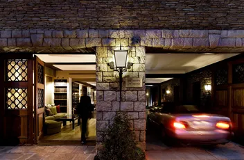
The name “Primero Primera” symbolizes the location of the noble floor or “piano nobile” in traditional Barcelona buildings.
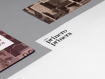
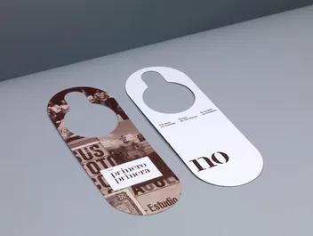
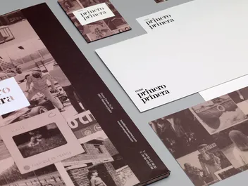
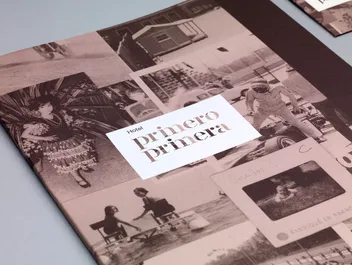
We crafted a stencil typeface for the logo, creatively abbreviating the word by removing part of the ‘M’. The identity embraces the rich family heritage through the integration of photographs collected over the years, establishing the home as a silent observer to the family’s evolution.
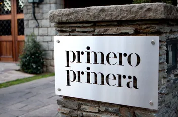
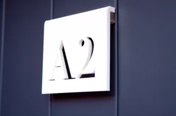
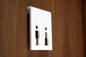
This tailored corporate typeface proved invaluable, serving as striking signage for the building.
