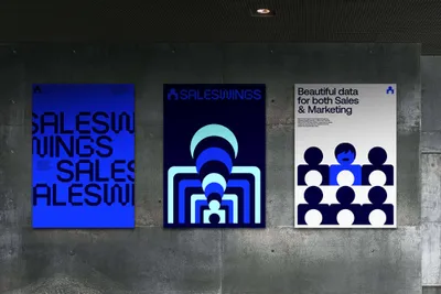
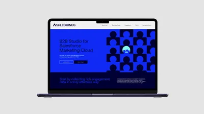
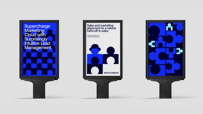
SalesWings, an innovative platform, offers businesses the capability to compile and connect customer data, providing a comprehensive view of potential clients. The platform eases the process of qualifying and profiling prospects, enabling personalized sales and marketing strategies. The task at hand was to craft a visual identity encapsulating the platform’s purpose, mission, and customer-centric approach. The identity was envisioned to be more than just a logo or color scheme; it needed to reflect the company’s essence and its dedication to intuitive customer understanding.
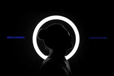
The strategy centered on capturing SalesWings’ core values—Friendliness, Partnership, Ease, Purpose, and Understanding—in its brand identity. These values were not mere guiding principles but key strategic elements that shaped the narrative of the brand. Each design element, from the logotype to color palette and typography, was chosen to manifest these values. Additionally, the strategy sought to redefine ‘lead’ from a mere marketing term to a symbol of the brand’s purpose-driven approach to accomplishing customer goals, emphasizing the importance of genuine customer connections.
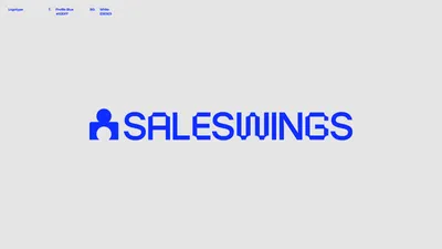
Mucho designed a logotype, merging the classic profile avatar with a puzzle piece, embodying SalesWings’ unique approach to customer understanding. This design led to the creation of an eye-catching color palette and a dynamic motion-based visual language. A unique typographic system was also developed, resonating with the ‘puzzle’ concept, enhancing the idea of each client connection as a fruitful partnership. Each brand value was expressed across all interaction points through a motion behavior system, resulting in a cohesive brand identity across all of SalesWings’ platforms.
