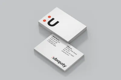
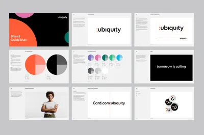
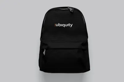
The new visual identity distinguishes Ubiquity as a B2B partner of choice that is truly dedicated to becoming an extension of their clients brands. This implied ‘bridge’ between Ubiquity and their clients informed the visual identity which cleverly takes the dots from the ‘i’s present in the name and recontextualizes them into a colon—a typographic connector.
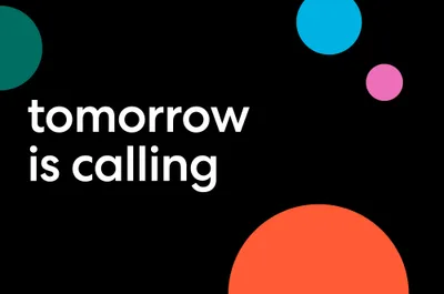
Mucho also created a new tagline: ‘tomorrow is calling’, as a nod to call centers as one of Ubiquity’s key products, but also the innovation they bring to the future of the industry. The notion of time also speaks to Ubiquity’s global reach, with delivery centers based all over the world.
