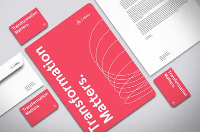
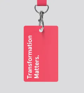
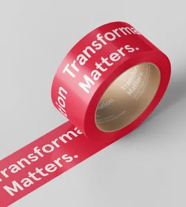
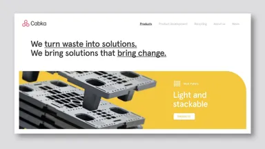
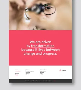
Logo Logo
  • Work
  • Strategy
  • Sharing
  • About
  • Shop
  • Contact
  • Work
  • Strategy
  • Sharing
  • About
  • Shop
  • Contact

Cabka

The transformative power behind a product as simple as a pallet

Client

  • Cabka

Industry

  • Product Design

Services

  • Brand Identity
  • Strategy
  • Tone of Voice

CABKA is a renowned producer of reusable transport packaging solutions, a pioneer in the creation of pallets and containers made by recycled plastic in Europe over 30 years ago, and is considered one of the key players in the industry.

After decades of mergers, acquisitions and multinational growth, they were looking for a unified brand that would resonate between teams, sites and family products – one that united the company under the same consistent narrative, verbal and visual identity.

Their rebranding was propelled by the challenge to be recognized as a key logistic partner for big corporations’ logistics optimization, instead of being perceived as a producer of one element of their client’s supply chain. The analysis phase determined the brand needed to enhance their value of smart design and material engineering, fundamental elements of their DNA, while also embedding their recycling know-how.

At the same time, they wanted to show off their attribute of recycled materials by placing it, instead of their main differential values, as a competitive advantage clients would acquire in their own value chain, since it would diminish their own global carbon footprint.

All in all, they needed to elevate their expertise as an innovative discipline they’ve mastered and led, and show how they enable breakthroughs across the supply chain and beyond with smart, reusable solutions for transport packaging, in a world where supply chains don’t just move things, but change things, making a positive impact.

Impact as what transformation leads to

The central idea for the new brand was Transformation: a double-sided concept affecting the client’s performance when incorporating CABKA’s products into their chain and, at the same time, making reference to the distinguished added value of creating products out of waste.

The narrative sets Transformation as the north star of innovation, and design is what brings it to life. It suited the company spirit, because it expressed their characteristic resourcefulness and relentless attitude, how they explore and innovate to deliver performance and impact.

This concept was encapsulated in the tagline for the new brand: ”Transformation matters.” Conveying commitment and resolution with their central value and working as a statement, the use of the word “matters” expresses the centrality and relevance of the material their activity is centered on – plastic waste.

A significant visual language while keeping the simplicity of its visual identity

Although the visual language needed to be created from scratch, the logo in particular had a level of distinction and simplicity that made sense to keep. So we restyled and evolved its look by making it look lighter, refining its strokes, and changing the typography for a geometric sans, which provided better readability. The result is a more stylized and contemporary brand.

Cabka’s new color palette looks fresher and more varied. We adjusted the main red so that it wasn’t so vibrant, and softened the black to a dark grey to achieve a good visual balance. Additionally, a palette of secondary colors was added, whose function would be to communicate and help distinguish the different product families among the company’s portfolio.

The visual language was based on a set of graphics that added dynamism and personality to the brand. Based on the idea of transformation, the idea of movement is palpable through the movements captured from one shape to another.

A clear tone of voice that adds differentiation

A tone of voice was also developed for the brand, based on the values of the new brand and the company strategy. A set of key messages was defined that were applied in several corporate applications: in the company presentation, in communication collaterals and across the website, to help convey the narrative of the brand and the company value proposition in a differentiated and compelling way. All the messages created put transformation as what Cabka masters and offers, to every partner, expressed as a high concept that brings progress and that the whole company strives for and pursues in everything they do.

A structured customer-centric commercial communication

In the commercial communications, the secondary color palette was used to add more impact to the compositions. We also added motion to bring dynamism to the language and make it stand out on social media.

At the same time, we composed a set of icons that provide order and information to the product range. The photography art direction uses framing and depth of field to refocus and emphasize the value of product design.

Related projects

92

Meight Driving Together

157

Finsa A book to start a conversation with the best creatives

258

Raden The future of luggage

384

ITT 1878 Celebrating those “sexy” trucks

We look forward to hearing from you. For new business, please contact the closest office directly. For general enquiries, please email us: info@wearemucho.com
San Francisco

+1 415 546 1399
sanfrancisco@wearemucho.com

466 Geary Street, Suite 500
San Francisco, CA 94102

Melbourne

+61 414 867 860
melbourne@wearemucho.com

Office 3, Level 2
358 Lonsdale Street
Melbourne VIC 3000

Barcelona

+34 93 481 40 89
barcelona@wearemucho.com

Morales, 27K
08029 Barcelona

Paris

+33 (0)1 73 71 58 20
paris@wearemucho.com

80 rue Taitbout
Square d’Orléans
75009 Paris

Copyright © 2023
  • Terms
Subscribe
Logo