When Robust sought to enhance its brand for the first time since 2012, they approached Mucho to create a stronger, more contemporary brand narrative and visual identity. The aim was to amplify its commitment to courage and ESG investment through a clear and impactful brand language.
Robust
Robust, an Environmental, Social, and Corporate Governance (ESG) fund, exhibits a firm belief in the profitability of ethics. The fund actively addresses global challenges, using investments as tools to influence companies’ ESG practices. In distinguishing itself, Robust avoids investing in sectors like oil, arms, or alcohol, and is actively combative, challenging companies during General Meetings to adhere to their ESG commitments.
Industry
FinTech & Investment
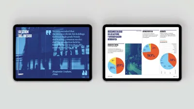
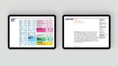
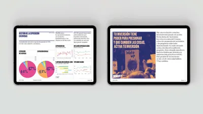
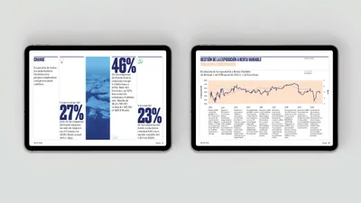
The design solution was a fine balance between a bold activist tone and a reliable financial entity. A clear and powerful messaging system, combined with accessible data visualization, forms the crux of the visual identity. The logo portrays the brand’s essence—strength, impact, and solid values, while also symbolizing movement, action, and growth. Additionally, a visually captivating language was established through images showcasing the significant role of light, nature, and activism—emphasizing the brand’s dedication to investing in the future.