Logo Logo
  • Work
  • Strategy
  • Sharing
  • About
  • Shop
  • Contact
  • Work
  • Strategy
  • Sharing
  • About
  • Shop
  • Contact

Visa

A symbol of change

Industry

  • Corporate Services
  • Product Design
  • Tech

Services

  • Brand Identity
  • Digital
  • Environmental
  • Marketing
  • Motion
  • Type Design

With 3.7 billion credentials in the world — both in digital form and physical such as cards — the Visa brand is recognizable to nearly everyone and has long stood for trust, security, acceptance and inclusion. Over the course of its 60+ year history, the company has maintained leadership by anticipating the future of commerce. Yet to most people, Visa has been synonymous with credit and debit cards, making it important to ensure it is seen as more than a credit card company and understood as a trusted network that empowers people and businesses to participate in the global economy.

Mucho, in collaboration with Visa, was tasked with creating a new brand identity system to change this paradigm — to re-position Visa as the network that enables the movement of a transaction from point A to point B, whether it’s person-to-person between friends, cross-border remittance payments for family members living abroad, or real-time payments for hourly workers in the gig economy.

The Strategy – Brand Blueprint

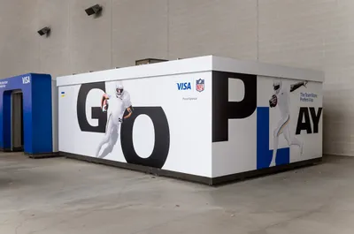
It was critical that the new Visa visual identity system represent the brand purpose and overall mission of the company at large. Visa did a significant amount of quantitative and qualitative research, including 200+ hours of conversation with key stakeholders in a range of markets.

These studies led to the creation of the Brand Blueprint, which lays the strategy and foundation for the Visa brand, culminating in its mission statement:

“We believe that economies that include everyone everywhere, uplift everyone everywhere.”
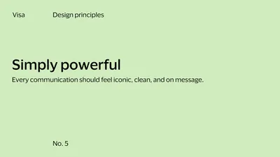
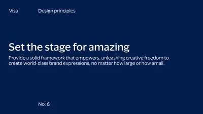

Design Principles
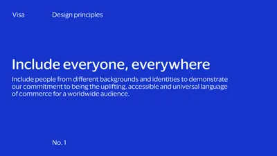
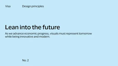
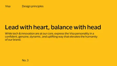
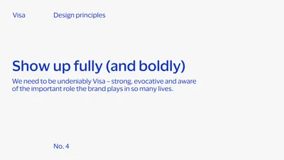
Building upon the brand strategy, Mucho developed six design principles to act as guardrails and reference points for everything that we would develop within this new brand identity. These new principles can guide internal teams and agencies around the world when rolling out the brand.

Brand Identity

One of the most important considerations when developing this new brand identity system was to create worldwide consistency of the brand, an holistic identity that would take Visa — a 60+ year old company and #8 on BrandZ’s most valuable brand list — and modernize its look for a digital-first world, while maintaining its incredible brand recognizability and equity.

Primary brand mark
The Visa brand mark is known worldwide as a mark of trust, security, and financial access. The design of the brand mark hasn’t changed, but we updated the color to capitalize on Visa’s heritage while telling a new story about the brand — evolved, brighter, and more dynamic. The intent was also to be more visible in the digital world and increasingly smaller mobile environments.

Supporting brand symbol
The Visa brand symbol speaks to the brand purpose. It represents Visa’s values and the belief that economies that include everyone everywhere, uplift everyone everywhere. The brand symbol reinforces Visa’s heritage and equity that Visa has built over the past 60+ years at point of sale.

A core part of the new identity was honoring the Visa visual heritage. The new brand symbol champions their values of access and equality, and brings the heart of the brand to the forefront. The symbol has always been there — we just dialed into the opportunity to use it in a creative way.

Rob Duncan
Creative Director, Mucho

A flexible system

The Visa brand mark and brand symbol work together to build equity in their visual heritage and elevate their brand purpose.

From the brand symbol, we derived a simple rule of thirds. The thirds-based grid system is designed to flex across any shape or size canvas, providing flexibility, while always anchoring the elements.

Color palette

There is now a one-color system for everything Visa. The core colors are blue, white, and yellow, with a supporting secondary color palette that adds flexibility. The palette can be dialed up or down, working across various audience channels and initiatives. The brighter core colors reinvigorate and modernize the brand. A secondary palette creates optionality beyond blue and yellow, keeping the Visa brand at the core, while showing up in different and exciting ways for a range of audiences.

Icon and illustration system

Using the brand symbol as the foundation, we extended the iconic color ratio into a unique icon and illustration system. The new system is consistent and cohesive. By creating a modular system in which icons and enriched icons can scale into illustrations, there’s potential to tell rich and engaging stories through illustration.

Photography

In all Visa communication, we wanted to put their customers first. A new cutout style of portrait photography established for the initial Meet Visa campaign was built upon. We augmented this style with full bleed authentic and genuine photography — editorial-style images meant to offer deeper detail and insight into the stories and characters from the Visa ecosystem. We also use cut out style photography for commerce scenarios, reflecting the simplicity of new payment technologies and transactions.

Typography

We created a new humanistic typeface, called Visa Dialect, designed specifically for their brand. An ownable typeface pushes brand recognizability and drives awareness. The typography was crafted to be digital-first and is highly legible across platforms.

Rather than adding a superfluous graphic language to the identity system, we concentrated on creative uses of the new typeface. By using Visa Dialect very large and cropping into the letterforms, we created a confident, bold expression for the brand. While maintaining legibility, the new typeface builds a more youthful and dynamic expression of the brand that can be used to create a unique look and feel for the many sporting and sponsorship events that Visa supports.

Sponsorship

Sponsorships are often the biggest stages to showcase Visa’s visual identity system in action, from the Olympic and Paralympic Games, NFL stadiums, and the FIFA World Cup™. Different elements — from the brand symbol, cut out photography, or bold cropped type — can be leveraged to make Visa stand out and make a statement.

The system is built to create a bold, impactful, and energetic presence wherever Visa appears.

Visualizing the technology of Visa

The B2B design system grounds itself in the core elements and offers expanded assets to help Visa better speak to B2B audiences by leveraging darker colors and using bold and beautiful immersive imagery and motion.

We developed a collection of immersive imagery, each speaking to a different core Visa B2B attribute — speed, scale, security, and connectivity. Each particle acts as visual atoms that represent the Visa network in an abstract way. They can take any form or shape and show smart behavior driven by external or internal forces.

Collective Intelligence

This was a project where our Mucho offices worked together to offer Visa a global design experience. In using our collective knowledge, we brought together the very best design talent in the world to help us, and we couldn’t have achieved this without them.

Visa Dialect was designed with Commercial Type. We worked with Ricard Jorge to help us conceptualize ideas for iconography and illustrations, as well as with Forma to develop the final iconography, enriched icons and illustration system. Photography was shot by Mo Studio. Broadcast animations, motion templates and multi-sensory moment were designed with Gimmewings. Immersive B2B films and imagery were created with field.io. Messaging and copy writing by David Begler and Laura Scholes. Never Sit Still helped us put everything together with the sizzle reel. Finally, very special thanks to Wieden+Kennedy and the Visa brand team for all their support and collaboration.

It was a truly global team, working together to create an ownable, dynamic, inclusive brand identity for a truly global company.

We wanted to evoke a sense of access and our belief in economic inclusion to underscore that Visa is so much more than a credit card company. The Mucho team understood the assignment and created a modern and dynamic visual brand identity that is engaging and visually compelling. We are immensely grateful for their vision and partnership.

Freddie Covington
SVP, Chief Brand at Visa

Related projects

56

Salesforce Ventures Pushing the edge of the cloud

87

Deem Easier to travel anywhere

93

Prove Safety in Numbers

178

Venmo Debit Card Having fun with funds

We look forward to hearing from you. For new business, please contact the closest office directly. For general enquiries, please email us: info@wearemucho.com
San Francisco

+1 415 546 1399
sanfrancisco@wearemucho.com

466 Geary Street, Suite 500
San Francisco, CA 94102

Melbourne

+61 414 867 860
melbourne@wearemucho.com

Office 3, Level 2
358 Lonsdale Street
Melbourne VIC 3000

Barcelona

+34 93 481 40 89
barcelona@wearemucho.com

Morales, 27K
08029 Barcelona

Paris

+33 (0)1 73 71 58 20
paris@wearemucho.com

80 rue Taitbout
Square d’Orléans
75009 Paris

Copyright © 2023
  • Terms
Subscribe
Logo