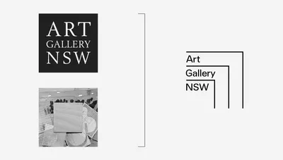
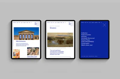
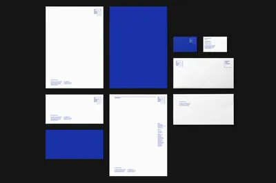
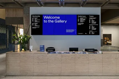
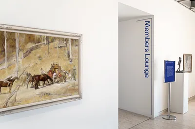
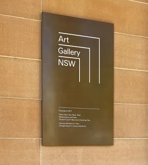
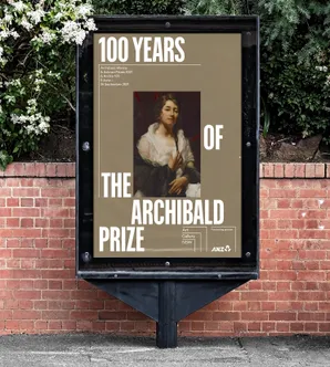
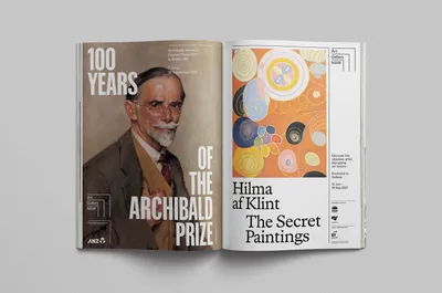
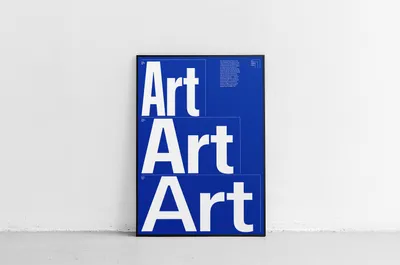
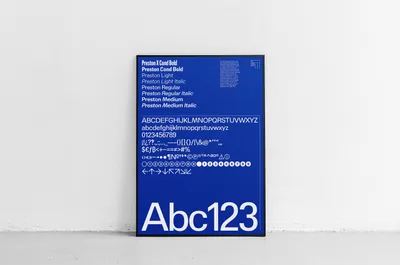
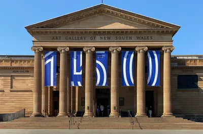
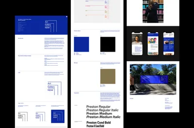
We conducted extensive research in the Gallery’s exhaustive archives and developed a creative territory inspired by AGNSW’s rich layers of history. We then developed a flexible and accessible system that reflects the dynamic institution and its increasingly broad range of audiences. Composed of three open-frames, the new symbol evolves the existing logo’s square form, referencing key features of the Gallery’s existing architecture and the dramatic new building by the renowned Japanese practice SANAA. A distinctive ultramarine blue is the brand’s primary colour, taking inspiration from iconic paintings of Sydney Harbour by renowned Australian artist Brett Whiteley.
From the design development phase onwards, we worked closely with the Gallery’s talented internal design team to refine our initial concept proposal. The system’s flexibility was rigorously tested by the Creative Studio across myriad applications including corporate marketing, publishing, activations, communications, digital and exhibition campaigns (the examples shown below were the result of this collaborative methodology). An identity for the 150th year was also designed as the scope of the project expanded. Motion design studio Gimmewings was commissioned to create a set of principles and guidelines for the ever-increasing volume of videos and animations required by AGNSW.