Process
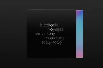
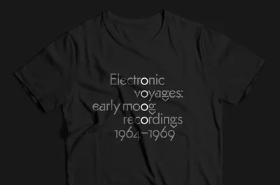
To create the title treatment and style, we researched the history of typography, controls and information design of various Moog synthesizers. The Minimoog, released in 1970, was arguably the most pivotal product to introduce electronic instrumentation to the mainstream. It was designed as an affordable and simplified instrument that combined the most useful modular components from prior Moog synthesizers into a portable keyboard. It quickly found favor with musicians of all genres, including Kraftwerk, Yes, Herbie Hancock, Keith Emerson, Abba, Gary Numan and numerous others.
The Minimoog had used the classic Futura typeface, designed by Paul Renner in 1927, for its panel graphics. Renner had also created an alternative version of Futura which featured a number of unusual and experimental characters not found in the final commercial release of the font. The geometry of those characters resembled some of the control designs and signal flow diagrams from early Moog synthesizers, so we used them as the starting point for developing the campaigns overall typographic style.
