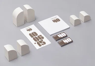
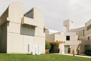
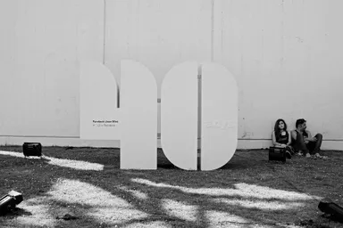
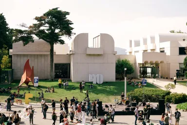
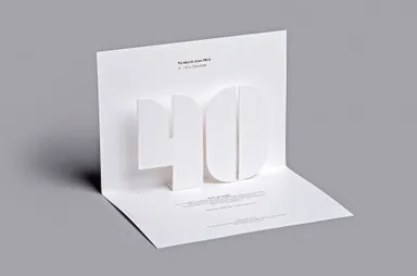
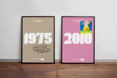
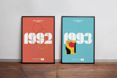
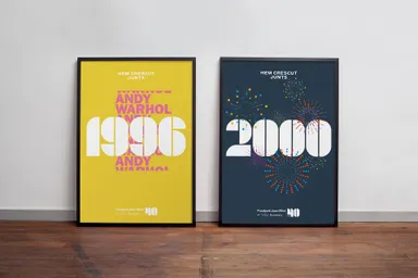
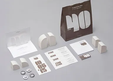
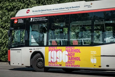
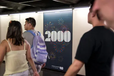
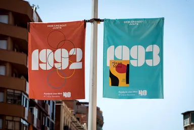
The solution was to draw upon the center’s recognisable building, designed by Josep Lluis Sert, and blend it with the number ‘40’. The building’s unique skylights served as the base for a typographical modular system. Not only did this address the logo design, but it also helped arrange the campaign’s key dates.
As the numbers were so distinctive, they could be coupled with various visual languages, enabling a rich graphic expression of the different events referenced.
