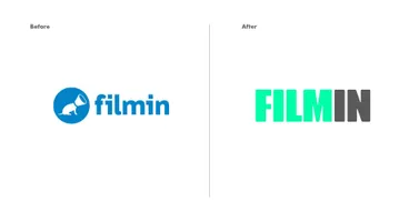
Filmin
Filmin
Redesign of the obsessive film platform
Filmin is an online movie platform. It is targeted at cinephiles: people who are truly passionate about the silver screen and want to have fun, learn more and, most importantly, watch movies and television shows whenever they want no matter where they may be. It is vocal, has an opinion and is not afraid to share it. Filmin is also a propositional platform. It does not have everything but does have movies for everyone. It selects its catalog based on publishing ideas, and this sets the tone it shares with its subscribers. Thus, when redesigning the brand, we had to keep sight of the fact, while considering all those aspects, that Filmin is simply good cinema, no matter what type it is or how specifically it is consumed. That is why all design decisions sought to capture something of the spirit of the classic cinephile experience and combine it together in a modern way.
THE TYPEFACE
For this redesign, we collaborated with typographer Jordi Embodas, who worked using his own typeface family based on the modular systems of billboards, slightly rounding the edges to improve readability and give it a contemporary twist. The family consists of two weights (Display and Text) for use in section headers, banners and, of course, the brand itself.
THE MASCOT
Known as “Filmcan,” this logo behaved more like a mascot than a symbol. While it had its own communication code, giving the brand a lighthearted look and serving as an element of communication for promotions, special editions and sections, it was limited by the fact that most of the customization was in its head and that such parodies and playing around were not always understood.
It seemed clear that any change had to take maintenance of the character into account. It also had to give it a more iconic nature that would allow us continue on with the brand’s existing code in a way that was more natural, closer to the world of emoticons and thus closer to the new forms of online interaction.
For this reason, we decided to show Filmcan’s face for the first time. There are two versions of it: a mascot and an icon. This allows us to alter the mascot and have it evolve when needed, enhancing the sense of humor and flexibility of Filmin’s personality. The Filmcan speaker is now geometric with rounded edges to draw a connection between the edging in the typography and also facilitate the symbol’s conversion to a diamond shape (code which Filmin identifies as a Premium Pack).
THE VISUAL CODE
By combining the Filmin typeface with images, a new color code and typographic lines (reminiscent of billboard structures), we can play with the promotional photos of the films to produce our own visual code and establish informational hierarchies (headers, promotions, etc.).
ONLINE COMPONENTS
Along with the new design, we also revised the components the website to generate greater readability and clearer hierarchies in the information as well as to achieve greater coherence between the elements that accompany the brand.
OTHER
The new typeface, the new codes and the new mascot allow us to create an entire battery of new applications, giving us countless new possibilities for the Filmin brand.