Value
Meaning
Future
Designed
Work Arts_&_Culture

Hac Te

Hac Te is an innovation hub located in Barcelona, focused on fostering intersections between Art, Science, and Technology. This novel initiative is a joint endeavor of nine institutions aimed at positioning the city as a global center for research, education, dissemination, transfer, and production in these intersecting fields. This new hub presents a unique opportunity to create a brand identity that encapsulates this forward-thinking and multidisciplinary collaboration.

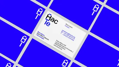
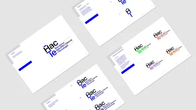
The strategic approach for this project required a creative play with language and symbols to reflect the brand’s central premise. 

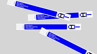
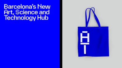
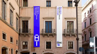
The Barcelona Hub d’Art, Ciència i Tecnologia was abbreviated to Hac Te, serving as both a descriptive acronym and a playful hint at the Catalan letters H and T, suggesting the English word “hacked.” 

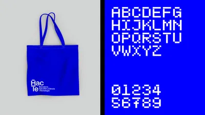
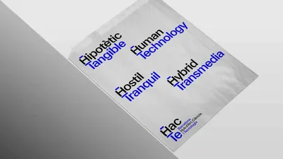
The central idea was to devise a visual language that signifies the concept of digital transformation, symbolizing the amalgamation of Art and Technology. 

This idea of duality was to be incorporated into every aspect of the brand’s communication, using contradicting concepts starting with H and T for description.

01 Hac Te Case 03

The design solution involved creating a logo representing both the hub and art, embodying the theme of duality. In line with the brand’s communication strategy, the logo is designed to express the intersection of art and technology. 

As an extension of the brand identity, a secondary display typeface was also designed. Based on the form of the logo’s H character, this typeface is a hybrid of sans-serif and pixel, reflecting the aesthetics of early digital technology while enhancing the brand’s visual language. 

The name was a collaborative effort by Mucho & Usted.

02 Hac Te Case 04
03 Hac Te Case 05
04 Hac Te Case 06