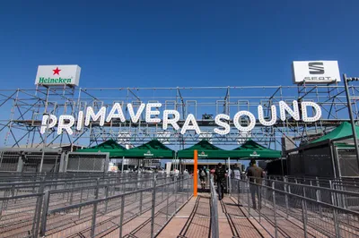
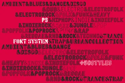
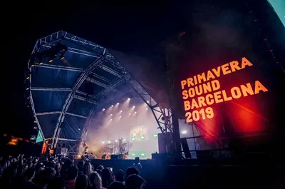
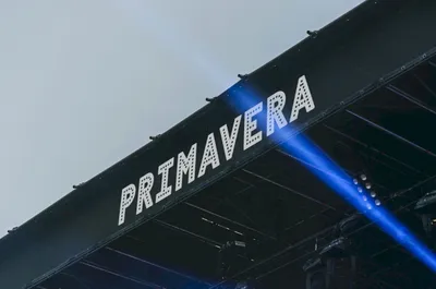
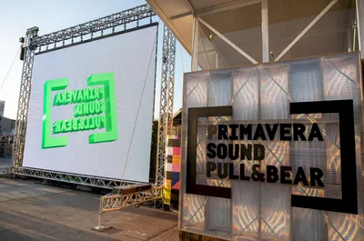
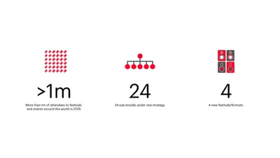
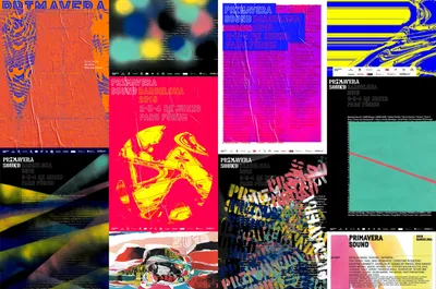
Logo Logo
  • Work
  • Strategy
  • Sharing
  • About
  • Shop
  • Contact
  • Work
  • Strategy
  • Sharing
  • About
  • Shop
  • Contact

Primavera Sound

Where music lives

Client

  • Primavera Sound

Industry

  • Arts & Culture

Services

  • Brand Identity
  • Digital
  • Motion
  • Strategy
  • Type Design

The Brief

As one of the most influential music festivals in the world, Primavera Sound has been the Ithaca, the Olympus and the Babylon of contemporary music for all types of music aficionados, music professionals, music junkies and music vampires all over the world.

Over the years, a myriad of new activities, services, products, channels, extensions, experiences have grown within, behind, beside and beyond the festival, causing the organisation a branding problem that blocked the ever-growing evolution of the brand.

The diagnosis was clear: the brand lacked a system that allowed it to grow with both versatility and consistency. As a result of it, Primavera Sound was becoming an increasingly incomprehensible house of brands, with too many types of (unconnected) brands, that caused inefficiencies, loss of opportunities (ei. sponsorship, co-branding, digital, media…) and a daily pain for the marketing, comms and branding teams within the company.

The challenge was to build a versatile branding system that would bring consistency and growth opportunities (new business models, new activities, products, services, channels…) in a structured way. However, this system should never go against one of the principles of the brand and the team behind it: creativity is a must and a constant. In their own words “homogeneity is not an option”.

Corporatism vs Personality

Every festival under the Primavera Sound brand had to be different in its visual expression, but all festivals shall build in the same direction too: there is only one Primavera Sound parent brand, globally, and it is more than a festival.

We needed a brand for the company, one for each of the festival’s, sub-brands for products and services, associated brands for other business models within the festival’s universe (some of them B2B like the agency or the artistic management and touring services) and media brands, among other potentially necessary branding elements.

Best branding systems are built upon simple but iconic branding assets or elements, sometimes a symbol, other times a wordmark. In our case, we realised that the most iconic piece of branding in the Primavera Sound visual universe was the sign over the festival’s entrance. If you have been to the festival, you know.

A new tool: Font family system

For this reason, we developed a constructive typographic system, with more than 50 typographic weights. A vernacular typeface with highly variable stains, easily combinable, with an exact structure that allows for variations and combinations. Each typographic family represents one of the many musical styles that the festival withholds. After all, nothing (aside from music itself) represents music like typography does. The vernacular approach pays homage to live music venues’ outdoor signs and labels because live music is, precisely and ultimately, the reason why Primavera sound exists.

Brand Architecture

As a system, typography works as an ally to generate hierarchy and order. As if it could turn up or down the volume or presence of the masterbrand brand in each level of the branding system: corporate, festivals, products and services, B2B brands, etc.

Fonts in use

This font system also opens the brand and partners to create curated but consistent merchandising, services, products or content. This gives freedom and flexibility to integrate the many brands that take part in the festival in one visual ecosystem and one comprehensive, fluid and interesting experience.

Beyond the visual redesign and technical boost, Mucho also helped Primavera update and reformulate its brand narrative and their tone of voice to use humor to get closer to its participants. To ensure the future was open wide but the essence jar was blood sealed forever, because Primavera Sound is, simply and amazingly, where music lives.

Related projects

150

Electronic Voyager Retracing Bob Moog’s Sonic Journey

161

No Flyers No Posters 25 years of Sónar Image

165

San Francisco Design Week, 2019 CommUNITY

246

Frameline 41 Genre queer, genre fluid, genre equality

We look forward to hearing from you. For new business, please contact the closest office directly. For general enquiries, please email us: info@wearemucho.com
San Francisco

+1 415 546 1399
sanfrancisco@wearemucho.com

466 Geary Street, Suite 500
San Francisco, CA 94102

Melbourne

+61 414 867 860
melbourne@wearemucho.com

Office 3, Level 2
358 Lonsdale Street
Melbourne VIC 3000

Barcelona

+34 93 481 40 89
barcelona@wearemucho.com

Morales, 27K
08029 Barcelona

Paris

+33 (0)1 73 71 58 20
paris@wearemucho.com

80 rue Taitbout
Square d’Orléans
75009 Paris

Copyright © 2023
  • Terms
Subscribe
Logo